
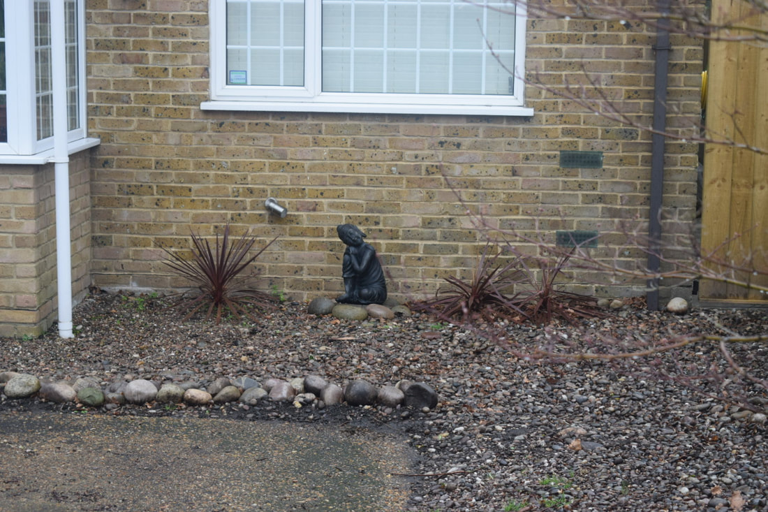
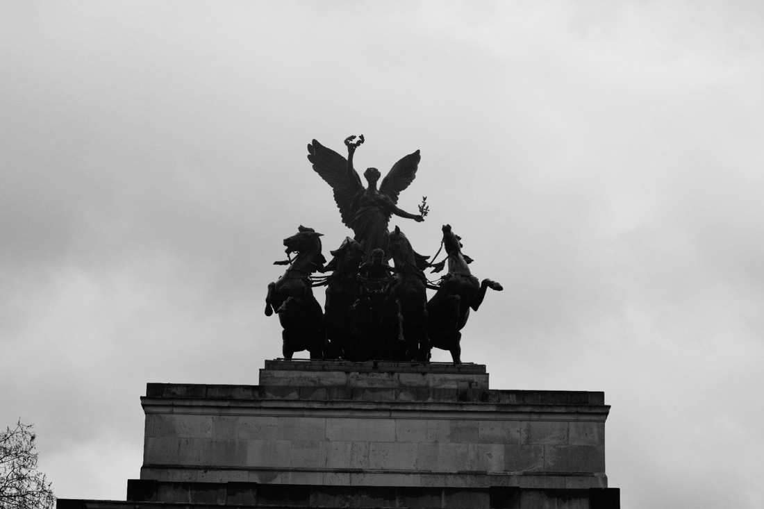
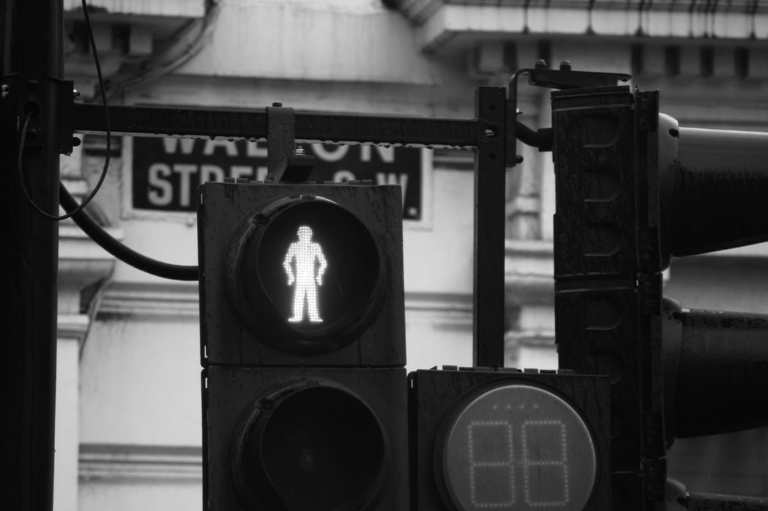
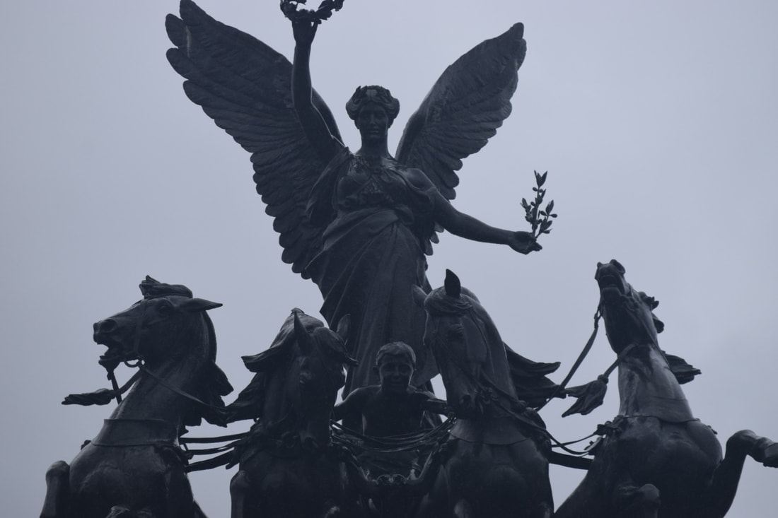
My favourite images so far...
Below are my favourite images that Ihave taken since the course begn. I think they are a good indication of the type of photography I enjoy. In most of them I really like the use of light, shadows and angles for example one of them the light hits the lens creating a bit of lens flare which is an effect I really like. As well as this one of them has lots of different levels, some of the buildings are high up some are low down and in this same image the slight mist covers the background which is the central city.


Photobook analysis - Incidental View by Andy Feltham
Incidental view is a photobook containing mainly peopleless urban landscapes which have "humanity at heart". The cover is an olive green with the title and authors name on it, it does not have any images on the front.


The photographs are of only places and things with an absence of people although the subject of each image is a result of human activity. I like the simplicity of the images, there is not a lot going on yet they are still interesting to look at due to the angles and lighting as well as the way the shadows act. The primary subject of most of the images is central presenting it in a simplistic way. The first two pages of the book contain the first picture and a definition of the word incidental. This gives and idea of what the photos could look like and also what idea the photographer was trying to get across. The primary aim of the photos is to "confront and question" the seemingly dull and mundane. Andy Feltham uses framing and exposure to separate the subject from its surroundings making you rethink these initially simplistic landscapes seem new and interesting. Each image image is of something that is isolated and this technique shows the underlying beauty of these objects and places that is normally overlooked.
Each image is carefully placed on the page with a reasonably thick white border around each one mimicking the photos themselves with their centralised and isolated subject. The photos seem almost isolated on the page. There are no captions, titles, descriptions or page numbers anywhere on the page. The way that the photos are positioned does not make viewing the book unusual in any way and it is like viewing a row of pictures on a wall. Where each photo is in the book seems to have been though out very carefully. It seems to be the progression of the day from morning to night. It also reminds me of an exploration in a way. It starts off with images of a beach which soon become images of concrete buildings, houses and cars.
|
|
To the left are two of my favourite images from the photo book. The left one seems to be below some sort of bridge or overpass. The two blocks of concrete look to be the pillars that support it which are fixed in the water. I really like the way the light looks through the gaps and the steam or smoke that appears to be rising from the water. The second image also appears to be underneath a bridge or motorway. It could also be a tunnel or canal. In this image I really like the way the street art and light are used. The light makes the 'jungle' the only lit up part of the photo which makes it seem almost like a window into another world. They both have quiet a mysterious film to them.
|


I feel like this theme of mystery is a common theme in this book as all the images are of places that seem to be almost deserted.
My response:


I think the process of creating my response was quite fun as it forced me to utilise light much more than I normally do when taking photographs as well as take pictures at night and later on in the day which I also don't do too often.
Kidbrooke Dérive
A Dérive is a French concept meaning "an aimless walk through city streets, that follows the whim of the moment. It is sometimes translated as a drift." We decided to go on a Dérive of our own, which took us from school around kidbrooke village and back, taking pictures of what we saw on the way. I think that the photographs I took look relatively similar to those that I have taken in the past however some I attempted to take in a way which is outside of my comfort zone. I definitely did feel slightly out of my comfort zone as I didn't have a specific idea in mind of what sort of photos i was going to take, i just had to come up with it one the spot. It definitely made me look at everyday objects differently as I really had to look closely for things to photograph, it made me realise that things you might normally just walk past without a second thought can actually turn into something interesting.


|
To the left are some of the images that in my opinion were more successful. I think this is due to the angles at which they were taken and the manual camera settings that I chose to use. For example the image of the waterfall I really like due to the long shutter-speed which added an interesting almost mysterious effect.
If i was to do this walk again I think I would follow a similar process. I attempted to look for photographic opportunities all around me, the sky, head hight and closer to the floor but I think I should try to look higher and lower a bit more often instead of just instinctively to the left and right. |


Next I went on a Dérive of my own. I decided to think more about the framing of my images than during our Kidbrooke Dérive where the images were more like random snaps.


I really like the images that I took and I think my work relating to Teju Cole helped that. I noticed things that were not in eyeshot that you might not normally see or think anything of but in reality they turned out to be quite good pictures. I also like the Dérive process and taking photos along the way as you never know where you might end up or what pictures you will take. I think this is a really helpful way to work as i think less about what i will take pictures of and just do it in the moment, I am less indecisive. I feel like these images are representing how people interact with the urban environment which is an interesting link to my personal investigation, however I think I definitely need to have a stronger focus on people and the candid element.
Concrete Doesn't Burn- Betrand Cavalier
Concrete Doesn't Burn is a book by Betrand Cavalier which displays the polarity between social classes. All of his photos are taken in European cities which have been impacted by conflict. He investigated how political conflict can become visible in the Urban Landscape. He also photographed the people and how their environment impacted them.
It is really interesting to compare places like Rotterdam which has been completely rebuilt after it was heavily bombed and Belfast for example where past conflict is visible to this very day.
It is really interesting to compare places like Rotterdam which has been completely rebuilt after it was heavily bombed and Belfast for example where past conflict is visible to this very day.


Above are some of my favourite images from the book. I really like the simplicity of some of them yet they are still very interesting due to the framing and angles. I also like the different architecture that is presented as it shows the parallels between different places. The pictures of people which are in are also very interesting as they effectively show the difference between the separate communities in each country. I think the book is a really interesting political statement and includes types of photography that I would like to experiment with and develop my skills in that area. They seem to be in a more 'documentary style' which I like.
Teju Cole
Teju Cole is a Nigerian-American photographer who created the photography book 'The Blind Spot'. He was inspired to create The Blind Spot when he woke up one morning and had lost the vision in one of his eyes. The book contains images from 5 continents, 20 countries and 60 locations ranging from New York to Lagos, the place in Nigeria where he grew up. He was intrigued by the aspects that linked all these different places, in his words "I am intrigued by the continuity of places, by the singing line that connects them all".
Each one of Teju Coles photographs are accompanied by some writing, this varies from being a couple of sentences to an entire page and tells the story of the image, this makes you look at the images from a new point of view and mirrors the fact Teju Cole is also a writer. The writing is sometimes from a religious view but in some cases tells a story of the place in which they were taken.
Each one of Teju Coles photographs are accompanied by some writing, this varies from being a couple of sentences to an entire page and tells the story of the image, this makes you look at the images from a new point of view and mirrors the fact Teju Cole is also a writer. The writing is sometimes from a religious view but in some cases tells a story of the place in which they were taken.


When looking at Teju Coles work I immediately notice the fact that in almost every picture there is a central figure, for example the pole, sign or bollard. Due to this being the aspect I noticed the most I wanted to incorporate it into my work. As well as this when I think about the title of the book itself, The Blind Spot, It make me think of things that you might not notice when walking around. This meant that when i was talking the pictures in response to his work I wanted to focus on the things that were less obvious, hidden away in the buses for example. The things you might not always notice when walking down the street.


Personally I don't really like the images I took. I think they are quite boring with not a lot going one although some of they are ok. I think its quite simply not a style of photography that appeals to me. Either way I think it was a helpful task as it helped me to notice the things around me that I might walk past on a daily basis but not normally notice or think anything of. It was something that felt a bit weird as I was trying to avoid taking pictures that I normally would, focusing on new angles for example and I struggled to really get started but once I did I quite enjoyed it.
Making day - 28.03.23
The goal of the making day for me was to begin to narrow down the exact focus of my personal investigation. I attempted to take photographs that felt natural for me to take on the street and interestingly many of them turned out to be architectural themed photographs.
All the images taken:


Narrowed down selection of 36 pictures:
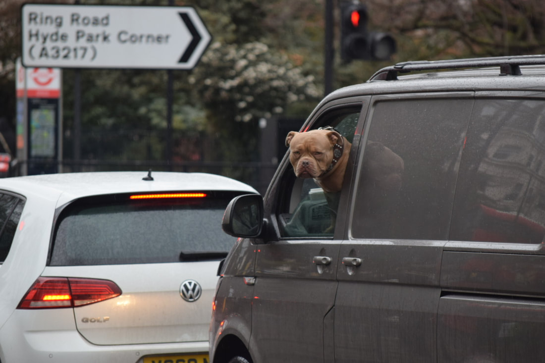
The photos above are what came out of my making day, around 95 photographs. I took my photographs around the SW1 postcode, near Hyde Park. We walked from Victoria station towards Brompton Road and then towards Piccadilly Circus. I think it was a fun experience as it is an area of London I don't normally go to so it was a new place to take photos. It was quite challenging due to the restraints of time. I didn't have as much time to stop and really take in my surroundings, I had to keep moving so I didn't think about wether or not I liked the image, I just took it and moved on. As well as this due to the time restrictions there were a lot of places we didn't reach which we wanted to go to.

I think most of my pictures have come out quite well. My intentions were partly to document London and I think I did this quite successfully. I started off by thinking about taking more colour pictures as I dont tend to do this however during the post processing i realised i prefer how some of them looked in black and white. I really like a lot of my pictures and i think that the lens i used really helped me take closer up more detailed images. I used a Nikon D3500 with a 200mm lens , this allowed me to get a closer view of objects that were very far away. Another thing i like about my images is they way they sort of show the history of London and how it has developed into what it is today.
I really like my online gallery and i think my use of scale was really interesting, for example the way they split off from one large image to two medium sized images then three small ones.
I really like my online gallery and i think my use of scale was really interesting, for example the way they split off from one large image to two medium sized images then three small ones.
Developing my idea-
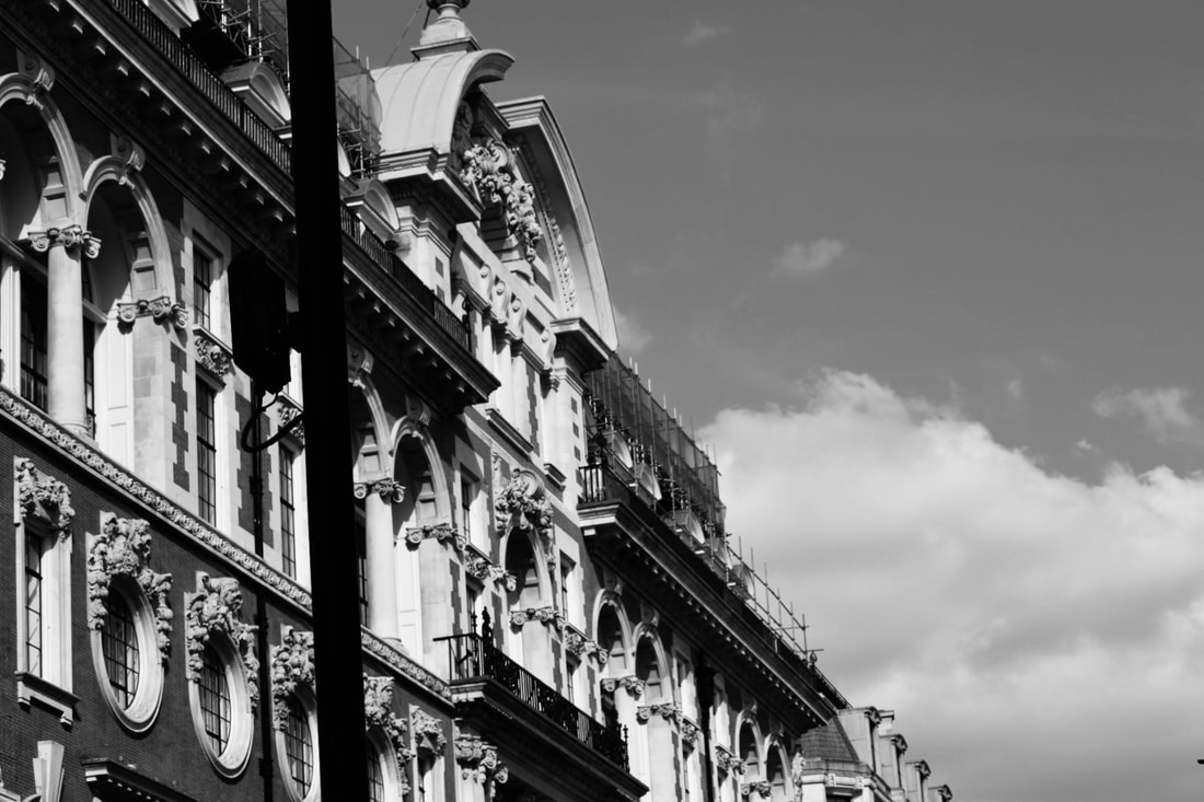
Below are a more images I took to try and develop my idea and focus on architectural photography. Although I like some of them as the harsh corners and angles combined with the shadows and light give really contrasting black and white colours I think a lot of them seem like 'tourist photos'. It has made me reconsider my interest and made me realise maybe its not the photographing architecture i enjoy, potentially it is the environment i am in; the urban/city landscape.
Below are a more images I took to try and develop my idea and focus on architectural photography. Although I like some of them as the harsh corners and angles combined with the shadows and light give really contrasting black and white colours I think a lot of them seem like 'tourist photos'. It has made me reconsider my interest and made me realise maybe its not the photographing architecture i enjoy, potentially it is the environment i am in; the urban/city landscape.


Wildlife photographer of the year
Recently I visited the Natural History Museum to see the Wildlife photographer of the year exhibition which consisted of the top 100 2023 entries. I chose this exhibition as wildlife photography was something that I have always been interested in and was the genre of photography that got me into photography. One thing I found interesting was the different equipment that people used to take each photo and the different setting used like the iso, it was very helpful to consider how I can use similar settings when taking my own photos. Something else I found interesting was how much a simple description can add to a photograph. A great example of this is the photo "The Bonobo and the Mongoose" although at a first glance it may seem quite innocent it potentially has quite a dark and upsetting backstory and it transforms the way you look at a photograph.
As well as this there was a short video about one of the 2017 finalists and his image of the Jamaican Iguana which was in danger of its habitat being destroyed. His photo raised awareness and saved the habitat even making it protected, it was very interesting to think about the real life political effect photography can have.
Tony ray Jones
While researching different street and architecture photographers I came across Tony Ray Jones. I was initially drawn to his images due to the documentary style. As well as this the way he includes the surroundings and buildings incorporates some previous aspects of my personal investigation.


When initially looking at his photographs I noticed that most of them are taken during the day and black and white, this I feel mirrors how I normally take photographs as personally I prefer the black and white aesthetic to colour photography.
Candid photos attempt 1:
Taking images of people is something im not really used to and have not experimented with very much. If im interested in focusing my personal investigation around documentary photography similar to Tony Ray Jones and candid photography it is something I have to practice and get used to it. I used the London marathon as an opportunity to start.


Fred Herzog
When looking for another artist to research multiple stood out to me but I was drawn to Fred Herzog's work due to his use of colour and documentary style photographs. "Modern Colour" is one of his most famous and comprehensive books which consists of over 230 colour photographs taken in the 1950s and 60s, a time where black and white photography was most dominant. The images document life in 1950s Vancouver and were taken when he would go on walks around the city. "Herzog’s photographs didn’t develop out of a conceptual framework in the studio. They came from walking. They come from that process of walking and that intuitive, deductive reasoning of where to be and how to take a picture when you’re there." Herzog used Kodachrome slide film ,despite it being notoriously difficult to develop and print, to create the bright accentuated colours which you can see in his images as well as a handheld 35mm camera.


Herzog came to Vancouver in the 1950s after leaving Germany after WW2. Herzog mainly photographed the poorer and working class communities and in his words wanted to "film the vitality of his adopted town." Interestingly he didn't like taking pictures of Vancouver initially as he thought it was ugly and unattractive. He had no interest in taking pictures of the richer areas “I loved the city for its grittiness. I wasn’t a journalist. I did not have the chance to become that. But I photographed like I was a journalist the scene that was Vancouver.” I find the way he wasn't interested in making the city look glamorous interesting as it makes me reflect on London and how it is depicted as an idealistic place but in reality there are a lot of underlying issues.
A lot of his images are candid portraits which made me question why he didn't want to take portraits with permission. In an interview for the Globe in 2012 he said "when people see you the picture is gone for good" which mirrors my own opinions as when portraits are not candid they seem less natural and more constructed which removes meaning from the image. You loose the raw emotion that is present on peoples faces.
A lot of his images are candid portraits which made me question why he didn't want to take portraits with permission. In an interview for the Globe in 2012 he said "when people see you the picture is gone for good" which mirrors my own opinions as when portraits are not candid they seem less natural and more constructed which removes meaning from the image. You loose the raw emotion that is present on peoples faces.
|
Image analysis:
The image to the right is one of my favorite images by Fred Herzog. I love the way light has fallen on the image, lightening up the woman crossing the road. As well as this there are the bright colorful advertisements. I think the image has been taken in portrait to make sure the entire building in the background is in the frame. The image is taken on Kodachrome film just like all his other images to ensure the bright signature colors are present. I think it is interesting the way he chose to exclude the group of people on the right and cut off the car on the left possible to try and make sure the ONLY focus in the woman crossing the road. |
|
My response:


Overall I think my response is decent. I attempted to follow the documentary style that is present in Herzog's work as well as include signs which is something that really stood out to me when looking at his work. Again I quite like the images and think it is a good response however I think that without the use of Kodachrome film it will never look quite how I want it to.
Peckham 24
Recently i went to the South London Gallery and the Copeland Gallery for the peckham 24 event which is a yearly event set up in 2016 aimed at showcasing and supporting the work of new photographers. This year the event was Body Language and how lifestyle effects our mentality. "the works on display consider the body and its gestures in all its multiplicity. Ultimately going beyond the boundaries of the singular, the artists included in BODY LANGUAGE consider the social conditions under which our bodies are made, and the ways in which such oppressive structures can be rebelled against."
The first Gallery we visited was the Copeland Gallery. My favourite section was a display about a girl and her mother who moved from Ukraine to England to escape the war while her father stayed behind to fight. It contained portraits and images of their home as well as letters to and from Ukraine. It really made you realise the severity of the situation and how it has effected people. Overall I think it was a really interesting exhibition about the political impact photographs can have and how effective they are at displaying these types of situations.


On the way I took different images to help with my personal investigation relating to 'candid street photography'.


Medium format workshop


Creating various different portraits we experimented with a Rolleiflex camera. Using a Weston Euro-Master we measured the light to ensure we were using the correct shutter-speed and took 12 photos which was the maximum amount possible with the roll of film. To develop the film we used a wet process where we put the roll of film into a developing tank. We then added the developer for 6 minutes before swapping to the stopper and then the fixer and finally hanging them up to dry.
8 page photozine
I decided to make a photozine to document some of my favorite images from my recent experiments, I initially chose a larger group of 16 images but I preferred a more refined 8 which I felt better documented the stage I was at with my investigation. I found this process to be much easier than the first time we did this in the form of our 20 zines and was very happy with the way it came out.


