


01: Light and Dark
Photographers and filmmakers can manipulate light and dark to create meaning or express ideas. In the black and white photographs of film theatres and seascapes by Hiroshi Sugimoto, the contrast and balance of light and dark can be sudden or gradual. Film noir is a cinematic genre where intense mood is evoked through the use of strong light and deep shadow. In the photograph Fig. 7, 2019, Erin Shirreff uses subtle and stark transitions from light to dark when recording the form and texture of unusual objects. Photographs by Emil Otto Hoppe of figures in front of buildings feature areas of solid black shadow and clear white illumination. Investigate appropriate sources and produce your own response to Light and Dark.
Initial thoughts and Ideas
I chose the theme 'light and dark' as it feels similar to the way I currently practice photography as well as including elements which I would love explore which I haven't before, for example film and moving media.
Initial ideas:
Initial ideas:
- Use natural and artificial light
- Experiment with shadows
- Experimentation with film
- Manipulate images with software like photoshop
Hiroshi Sugimoto; Theatres and seascapes


|

|

|

|

'Seascapes' and 'Theatres' are two series of photographs created by the photographer Hiroshi Sugimoto. Each photograph uses different shutter speeds and exposures to create very contrasting blacks and whites.
Theatres was created with an interesting method. Sugimoto used a large format camera and removed all light sources so that the only light was coming from the screen. He then left the film running for its entire duration with the shutter open only closing it at the end of the film, the result were these breathtaking images that capture the internals of the theatre with the light bursting out from the center.
A similar process was used to create seascapes, a large format camera paired with a long exposure creates this smooth seascape. I really like these two processes as they capture the extremes of light and dark in a detailed intricate way that I have never come across before.
I decided to create a response to Hiroshi Sugimotos work using similar techniques. I used a variety of shutter speeds from slow to fast in order to exaggerate the dark shadows and light. I wanted to create two sets of images within my shoot, one using natural light which is more similar to Sugimotos' seascape series and one using artificial light more similar to his theatres series.
When taking my images I started off by using artificial light to create the desired effect before going on a second derive, utilising only natural light.
When taking my images I started off by using artificial light to create the desired effect before going on a second derive, utilising only natural light.


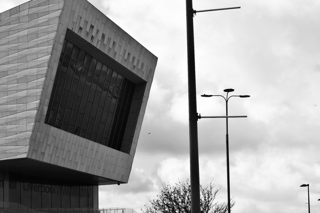
My aim with this photoshoot was to explore light and dark within the city by utilising different shutter speeds to capture the extremes of light and dark. Although I'm not a massive fan of the images I took I think the most successful ones were the images I took at Westcombe Park train station and at a recent concert I went to.I think I was limited by the slower shutter speeds as I didn't have access to a tripod so camera shake was picked up on. What I realised when taking photographs for this response was how much I enjoy using artificial light in my work, this is definitely an aspect that I will stick with and develop further as I work through component 2.


In order to display my best images so far and to try and display the direction I want to take my investigation I decided to create a short leaflet style book using indesign. During this process I realised that my favourite images that I thought were most successful included artificial light, this is definitely something I will need to delve in on. When making my booklet I wanted to try and add the idea of light and dark into the display. All of the images I took were very dark so I thought surrounding them with a lot of white space would be a good idea, mirroring the contrast present within the images themselves.
|
|
|


|
|
|


FILM NOIR
- low lighting schemes which result in sharp contrasts and dramatic shadow patterns
Film noir is french for 'black film'
often feature skewed and low angle shots (dutch angles)
deep focus used e.g in citizen kane
characters 'walk the tightrope between good and evil'
audience examines their own morality
Film noir, French for black film, is a term first coined in the 1930s, 40s and 50s to describe the dark American detective and 'gangster' films of the period. These films tended to be reminiscent of the period, after the great depression where the average American citizen was driven by the desire for money and crime was almost becoming an aspect of day to day life, similar to the characters and stories of these films. These films were often shot in the intricate bustling American cities like Los Angeles and New York. In my opinion this mirrors the mysterious tone which these films have to them. All the back alleys and side streets of cities like New York give me the impression that you never know what is going on and there is a strong element of mystery to them. It makes me think of a sort of fog hovering over the city at all times which is one thing that my mind jumps to when thinking of Film Noir. As well as this most of the primary characters in these styled novels and films were unhappy reflecting the dark visuals. As well as the characters unhappiness being displayed in the visuals, the darkness also exacerbates the evil and dark nature of the story and actions.
Film Noir has some recurring visual devices and techniques which I am keen to experiment with. Low lighting is almost always present leading to dark, strong shadows and sharp contrasts, reflecting its genre name 'black film'. It often features low angled shots looking up on the protagonists or skewed looking on from a side angle. These angles are used frequently unlike a more traditional front on shot. The entire scene is also kept in focus no matter what is going on in the scene, wide angle shots are used even if only one person is talking for example.
Double Indemnity
In order to establish a firmer grasp on the genre of film noir and make sure I was aware of all the characteristics and how they are used I decided to watch Double Indemnity, one of the most famous and well received Film Noir movies of all time. As I watched I made notes on different aspects of the movie and wider genre, for example, I might recognise as a feature of the Genre or something that I find interesting and want to incorporate into my work.


Notes:
- The film begins with wide angle shots of a car racing down a dark street lit only by street lights, set at night with noticeable contrasts between the blacks and whites.
- Lots of use of shadows to cover up the characters creating quite a mysterious mood.
- Relatively frequent lack of any form of light, natural or artificial.
- Shadows seem to always be falling on one of the characters faces. When watching I perceived this as showing the mysteriousness of the characters, the hiding of their dark desires. Shadows are sometimes related to secrets so the shadows on the main character represent this secret he is hiding and the contrast in his personality.
- Quite frequent use of low and high angle shots.
- The characters never seem to be looking at the camera, eye contact is rare and often filmed from the side.
- Often only the foreground is in focus ,regarding closeup shots, and the background is blurred.
- Uneven lighting, some parts of the scene are more visible than others.
- Majority of the filming is done in the dark making the shadows even more noticeable.
- it seems up to half the scene is in darkness.
I decided I wanted to do two things in my response to the genre 'Film Noir'. As well as taking a series of photographs inspired by the genre and utilising some of the techniques used, I also want to create my own short film taking inspiration from Double Indemnity specifically.
The first set of images I took was mainly focused around utilising natural shadows and the images from later on in the day were slightly more focused on capturing artificial light, relatively similar to my previous photoshoot. I took some images during the day as this is when the shadows were most prominent before taking the rest at night to capture the artificial lighting, developing my interest in artificial light but also beginning to utilise natural light more.
The first set of images I took was mainly focused around utilising natural shadows and the images from later on in the day were slightly more focused on capturing artificial light, relatively similar to my previous photoshoot. I took some images during the day as this is when the shadows were most prominent before taking the rest at night to capture the artificial lighting, developing my interest in artificial light but also beginning to utilise natural light more.


I think the photographic response was quite successful, the fact later on in the day it began to rain added to the ominous dark tone I was aiming for I think improving my response and the dazzling headlights from cars for example I think look really good, reminding me of the opening scene of Double Indemnity.
Creating my film was quite a fun task as it is an aspect of photography that I haven't really used yet. One thing that was slightly frustrating however was the audio. when taking the videos the audio was mostly just loud wind and I felt that it didn't really fit the theme and ruined it in a way so I decided to mute it, I think this was the correct decision as the audio previously was too distracting and damaged the aesthetic that I was trying to achieve. When taking the individual clips for the video I consciously used many different angles, similar to in Double Indemnity where in many cases the scene is being shot from below facing up or from an overall higher angle.
|
|
Emil Otto Hoppe
Emile Otto Hoppe was a British-German photographer who took relatively 'street style' photographs' and seems to frequently incorporate silhouettes into his work which is something that really appealed to me. I found the contrasts but also the amount of detail he still manages to include in his work fascinating and something I would love to investigate.


The images above are some of my favourite by Otto Hoppe. The top left image is slightly different to the rest as it is more of a landscape photograph compared to some of the others, however I feel that it still fits with the overall theme with very strong dark blacks in the foreground and lighter colours and more complex detail and patterns in the background.
For my response to Emil Otto Hoppe I think visiting more industrial areas would be a good first step, for example areas closer to Woolwich and the river thames to find similar types of architecture and similar structures.
For my response to Emil Otto Hoppe I think visiting more industrial areas would be a good first step, for example areas closer to Woolwich and the river thames to find similar types of architecture and similar structures.
Below is the first set of images that I took relating to the work of Emil Otto Hoppe. The main focus was to incorporate silhouettes into my work focusing on the background as a main factor.
I don't think that the first set of images were that successful. It was much harder than I expected to create photographs in this style as in many cases trying to include so much background ruined the silhouette effect that I was trying to achieve. It was very difficult to capture the light in the correct way, however In some cases I think I did a good job.
I don't think that the first set of images were that successful. It was much harder than I expected to create photographs in this style as in many cases trying to include so much background ruined the silhouette effect that I was trying to achieve. It was very difficult to capture the light in the correct way, however In some cases I think I did a good job.


What i noticed is that my most successful images had the sky in the background, so taking note of this I created a second response, focusing slightly more on achieving the basic silhouette look, which overall I think was far more successful. I also used different shutter speeds when taking the images, thinking back to my work on Hiroshi Sugimoto.


I think these images were far more successful compared to my first shoot. taking photographs against the sky and other plain backgrounds was a very effective method to produce silhouettes. Initially the photographs were in colour but I found that when in black and white, similar to Otto Hoppe, the dark colours within the image are accentuated. As well a this for some photographs I experimented with the exposure, both with the camera and editing them simply on my phone. In some cases I lowered the exposure so the main dark subject is extremely contrasting with the background.
Kai Ziehl
Kai Ziehl takes 'street photography' style images of ,normally, singular figures in black and white utilising sharp shadows, very dark black and bright white to accentuate the detail and depth of colour present in his work.


Having already experimented with shutter-speeds and shadows when responding to Hiroshi Sugimoto and the Film Noir genre I think this would be a good way to progress. In each of his images it seems to me there is always one lone figure making the surroundings seem almost deserted. I think this would be quite an interesting aspect to investigate, creating this mysterious feeling about the images using shadows.


Overall I am really happy with how my photographs came out despite the lack of a lone figure which I initially set out to achieve as in London this proved to be extremely difficult. For this first shoot I waited quite a while to go out as shadows were such a vital and important part of this shoot so a clear sunny day would have been optimal. I think that this decision really benefited my photographs as the dark, prominent, angular shadows I was looking for were clearly present. I decided to go to central London, towards the Southbank as I thought that the architecture would create the types of shadows I was looking for. Taking inspiration from my responses to Emil Otto Hoppe I also wanted to try and capture silhouettes again as this was a process that I really enjoyed and I really like the outcomes that I ended up with.
Diptychs


|
|


|
|


|
|


The images above are what I felt were the most successful. I decided to arrange them into diptychs. One thing that stood out to me was the fact that most of them have been taken from above, a high angle, which I thought was interesting as I wouldn't have expected these to be my favourites, I don't tend to use these sorts of angles. I am also really happy with the silhouettes, the dark foreground and lighter background create the perfect effect really reminding me of Emil Otto Hoppes' work.
I decided to make a short 6 page zine to display this shoot, with a white background similar to previously creating a lot of contrast between the photos.
I decided to make a short 6 page zine to display this shoot, with a white background similar to previously creating a lot of contrast between the photos.


Keld Helmer-Petersen
When thinking about what I liked the most about the images I have taken so far, the processes as well as what springs to mind when thinking of 'light and dark' the work of Keld Helmer-Petersen stood out to me. Specifically his set of 3 books; Black Noise, Back to Black and Black Light which show the extreme differences in light and dark that I have been focusing on so far. The series contains a range of what seem to be film negatives that have been scanned and edited, removing all the mid tones. The photographs range from being quite detailed, pictures of buildings for example to something quite simple like a paper clip. The images do a really effective job at displaying the stark differences between light and dark.

|
|
I was also inspired by two of his short films; 'Chicago Light-Motion Study' and 'Copenhagen Boogie'. Within these short films he uses light and reflections to create mesmerising black and white films.
|
|
|
My first attempt at responding to the work of Keld Helmer-Petersen was by editing some of my previous images in Photoshop. It was a lot of experimentation as many methods of editing the midtones, for example select<colour range< mid tones, didn't achieve the extremes I was trying to reach.
|
|
Instead I found a method of using the magnetic lasso tool to select the middle area of the image and then using the curves adjustment feature to add contrast to the mid tones and achieve the effect I wanted.
|


Overall I am happy with my outcome. I successfully created the stark contrasts between black and white however the photographs seem too artificial so although this sort of style somewhat appeals to me, the work of Kai Ziehl and Emil Otto Hoppe for example, I think is more of my own style and I prefer outcomes as well as the overall process, most notably the use of artificial light.
The next stage of my response was to respond to the two videos made my Petersen, Copenhagen Boogie and Chicago Light-Motion study. The first thing that comes to mind when looking at the videos was the clear use of artificial light, for example street lights. In Copenhagen boogie it seems that artificial lights have been used to create contrasts between black and white in each clip and also by utilising what seem to be ripples in water, create constantly changing lighter and darker sections. Chicago Light-Motion study reminds me more of the Film Noir genre which I previously researched with street lights and cars being the only light source in an otherwise pitch black video. So far using artificial light in my work has been the aspect which I have enjoyed and has interested me the most so I think this will be a good next step in my research.
I am really happy with how my video came out. Differently to the previous Film Noir video I made, I left the original audio and added a song, similar to what Helmer-Petersen did with Copenhagen Boogie, in order to achieve the mood I was going for although in my opinion his music choice seems to be reflecting the movement of the light and ripples in the water. I left the original audio in as I thought the sound of the camera focus and sound of the late night traffic really added to the sombre almost nostalgic feel and tone of the video. I really enjoyed finding interesting angles to film things like lights shining on water ripples, and the reflection of cars driving past which created a really interesting effect with the dark water acting as the background.
Jordan Curtis Hughes, double exposure experiment
Jordan Hughes is a photographer and director who is currently working alongside the band the 1975 working as a concert photographer on their world tour. Something I found interesting was his use of what seems to be film photography and double exposure, something that is relatively unusual for this sort of photography, but something I have always wanted to experiment with.


For my response I am going use a roll of black and white film to create images using the more 'traditional' method of double exposure instead of photoshop. When taking my photos I am aiming to create darker middles sections of the negative, with overlapping focal points for example, with the sides of the images being lighter. Double exposure photography is something I have never done before so I am quite nervous to see how it comes out as It will be easy to over expose the frame.
This first shoot came out really well. I was a bit nervous that things would be overexposed due to the fact you are exposing one frame twice and I would end up with a roll of blank film. I think I did a relatively good job at achieving the darker and lighter sections within each image. The next step for me I think will be to refine my use of film photography, focusing in on the use of artificial light and taking photographs during the night.
The next part of my response was to create enlarged versions of my negatives in the dark room. This was a really fun task and something that I have rarely done so a good chance to develop my skills in the dark room.
The next part of my response was to create enlarged versions of my negatives in the dark room. This was a really fun task and something that I have rarely done so a good chance to develop my skills in the dark room.
|
|
|


Overall, I am really happy with my outcome. Next time I think I need to be more careful when lining up the photographic paper with the projection as in some cases a small section of the paper could be left unexposed. This experiment did also somewhat remind me of the work of Keld Helme-Petersen as in some cases where a certain part of the image didn't quite develop enough the stark contrasts between black and white, which I achieved digitally using photoshop, were somewhat present.
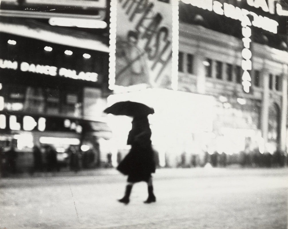
The New York School Photographs 1936-63 and Ted Croner
'The New York School Photographs 1936-63' is a book by Jane Livingston and contains a range of photographs from 16 photographers who were part of The New York School of Photography. They photographed New York City from the late 30s to early 60s and a collection of photographs from each of the photographers was put together. All the images are in black and white depicting New York in a gritty and brutal way. The photographs that really stood out to me seem to have a lower shutter speed as in many cases a lot of camera shake is visible.


One photographer, Ted Croner, specifically stood out to me. I think his film photographs of New York which tend to utilise the abundance of bright lights to capture New York in an exciting, energetic but dark way are incredible. When moving on from my first film and double exposure experiment one of the main things I was looking to do was create a series of images with artificial light and at night and a response to Ted Croner would be the perfect opportunity.
The images below are my favourites by Croner containing a wide range of techniques. Slow shutter speeds and double exposure for example.
The images below are my favourites by Croner containing a wide range of techniques. Slow shutter speeds and double exposure for example.
|
|

|


I decided to take a series of photographs in response to Ted Corner around London attempting to utilise the artificial lights, long shutter speeds and developing my use of double exposures to create a second set of photographs that can be used during the 3 day exam.
Overall I think my response has been very successful. My main concern was the photos being underexposed due to taking the images in the dark and a few of the negatives did look to be somewhat underexposed however the majority of them came out looking really good. I wanted to try and take aspects of all the photographers that I have researched throughout component 2 incorporating aspects of all into the set of images and I think I did this really successfully.
Final book
To conclude my research leading up to the 3 exam days I decided to create a final photo-book with all my favourite photographs that I have taken throughout component 2, which I think present my interests in the topic, bringing together all the aspects of 'light and dark' that have interested me, and then put it into Calameo to display it in an easy access virtual way.
Making day plan
what I need:
different size photographic paper
picture frames
projector
stands/tables ect.
day 1: begin the process of enlarging my negatives, find the optimum exposure time and aperture for the different light levels, some haven been taken at night and some at day so finding the best exposure time for is the main aim. experiment with different exposures, making them lighter and darker, potentially experiment with some dodging and burning.
day 2: finish enlarging the images, let them dry, and start framing them and organising how they will be presented in the exhibition. create one final video using all the videos I have created throughout the course to project over the exhibition when I am creating the different light levels.
day 3: use the studio or back of 1117 to display the images on different levels and use lights to create shadows and different light levels across the exhibition. project the video I made over the images helping to create different light levels. Film and photograph the exhibition.
